Is your Duda or Ecwid online store widget loading slowly? With Google Pagespeed being so important today, this article shares two vital tips that will improve your product page speed and also allow your end users to leverage a custom way to access product categories.
Tip #1 - Optimize Your Images For Page Speed
The first tip is the most obvious. If you expect products to load quickly on any website, you need to ensure that they are optimized for page speed. From our experience, it's great to included multiple images for each product BUT
the initial product image, or the one that is loaded by default, needs to be a PNG image on a transparent background.
Your transparent PNG product image should have a resolution of 72 pixels per inch and should be less than 1000x1000 pixels in width and height. In this example we'll use a 700x700 pixel image in order to keep the filesize as small as possible but still keep the image size large enough in order to get a good visual overview of the product.
No Photoshop? No problem! Visit Pixlr.com and resize your oversized product images for free. Most professionally shot product images will be delivered at 300 pixels per inch and can exceed 3000x3000 pixels. You certainly do NOT
want to upload those to your website. Shrink those babies down in order to ensure your product page speed doesn't crawl.
Example:
Original 3.9MB product image delivered to client at 300 pixels/inch with a width and height of 4000x4000.
Now, opening that same file in Pixlr, we will resize it for web use. From the main menu in pixlr, click Image - Resize. You'll notice that the pixels/inch setting is not visible. Bummer! But don't worry. Continue to resize the image to 700x700 pixels, make sure 'constrain properties' is checked, and click ok. If your image isn't square, just ensure the long side is set to 700px. Next, click File - Save. Ensure that PNG (transparent, full quality) is selected and rename the file so you don't overwrite your original. Now, go into Finder or Explorer and check out the file size. I'm sure it's drastically smaller but let's do ONE MORE THING
to shrink it. Open a new tab in your browser and goto
https://imageoptim.com/versions.html . Download the proper app depending on if you use a Mac or a PC. Once you've uncompressed or installed the app, open it up and you'll notice a very simple interface. For Mac, you just drag and drop the new PNG you exported into the window and it will shrink it down just a bit more. How much? In our example we chopped off 29% and took the file down from 165k to 116k. Odds are, if we dropped the file size to 500x500 or 600x600 pixels, which is still very much acceptable for online product sizing, we'd get the image below 100k. The smaller you can make these file sizes, the better!
Bottom Line
- Shrink your images with tools such as Pixlr and ImageOptim before uploading your product images and it should boost your page speed. Do you have to use transparent images as your primary product image? No, but if you can, you should be able to keep the file sizes small enough so they don't negatively impact page speed. Last but not least, it's a good habit only to use PNG files for images with transparent backgrounds. For any other non-transparent image type on your website, use JPG (JPEG). Once again, pay close attention to file size.
Tip #2 - Hide Product Categories And Manually Build Category Links
When configuring the store widget you'll notice that categories and products are displayed by default. What I've found is that by disabling or hiding the categories within the widget, you can instead manually add a text and image section above the store with category specific links that then take the visitor to the proper filtered page result.
It makes sense to try this workaround if your store widget is loading slowly and you've already optimized your images. Displaying the categories within the store design widget may be slowing down the page speed and by disabling them and instead using Duda icons, text, buttons, or small images, you can still drive visitors to the categories. As an added bonus, you also have more control in how the categories are displayed, rather than using the widgets limitations.
Another reason to consider having a custom category link section above the store widget is that the category section may be be partially above the fold and should load almost instantaneously while the store widget is normally delayed. Your site visitor may not notice the slow store delay as they normally wait 1-2 seconds while viewing the header and category section before scrolling.
How do we do this?
First of all, make sure you have created your store categories and have aligned your products to the proper categories. This way, you can obtain the category specific urls and begin testing the result in order to ensure the proper products are being displayed.
Find Your Category Specific Urls
Assuming that your categories are being displayed right now using the default settings, open up the formal or sharabble preview window from Duda that you would typically send to a client. One at a time, hover over each category, right click, then copy and paste the unique urls into notepad or some other text editor. Save this file for later reference as 'product category links' and make sure you documented which category aligns to which link.
Hide Or Disable Shop Widget Categories From Displaying
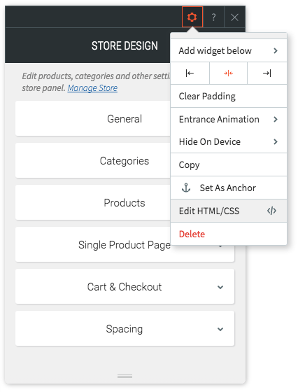
From my experience, applying the CSS to hide the categories is easier if you access the code specific to the widget you want to update. For this example, I'm going to click on the store design widget on my home page and then click on the config or sprocket button then click Edit HTML/CSS from the menu.
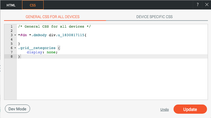
Now, copy the code in red I've provided below and paste it as shown into the widget's CSS section for all devices.
.grid__categories {
display: none;
}
Now, click update to apply the css and then go check out your widget. No more categories!
But Wait!??! How do you disable or delete the custom CSS? Ironically, if you go back into the widget's specific CSS, your code may be stripped out. In the next section I'll show you how to remove the CSS if you no longer want it applied but we'll do that by going into developer mode at the site level and not at the widget level.
How to Restore Your CSS And Display The Categories Again
Before we do ANYTHING else. Goto SETTINGS-BACKUP and create a new backup of your website. It's a good habit to get into, especially if you plan on going into dev mode to customize anything. Now, instead of accessing the widget specific CSS, we're going to open your full site CSS and HTML settings by entering developer mode. Click on the
</> button in the Duda header as shown below to enter DEV mode:
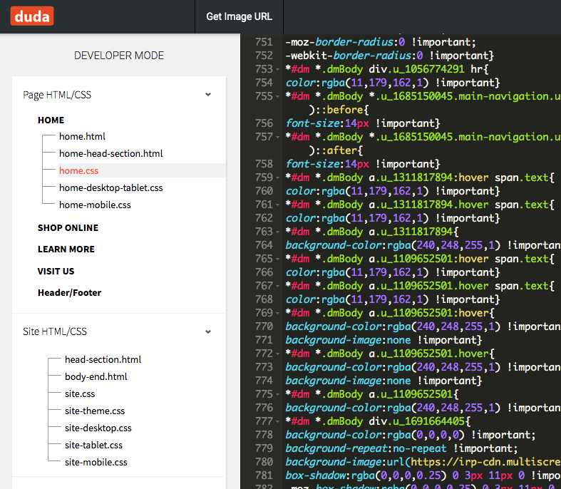
Once developer mode is opened, you'll notice a bunch of code on the screen and a navigation section on the left side showing different pages, folders, html, and css files. Click on the page specific css file you want to update. In my example, the shop widget I wanted to modify was on the home page so I am going to update the home.css file. Your case may be different and perhaps you want to update store.css or shop.css depending on how you named your store page where the store design widget is being used. See my example below that shows I currently have the home.css file open for editing.
On the right side, or code side, scroll down to the very bottom. You should see the custom css code you pasted in at the very end. Go ahead and delete the code (see sample image below). NOTE!!
If you happened to paste in custom CSS multiple times using the store widget, you may see multiple CSS entries impacting .grid__categories. If so, you will need to delete each instance in order to reset the widget to its default configuration.
Awesome! Now, click the Save button up top (and as shown below) and you will commit your updated CSS changes. Once you've clicked Save, you will then need to click Close to go examine and test your store widget.
Manually Create Category Links On Your Page
In the final step you would create a new section above your store design widget that contains the buttons and/or links to the store categories. Use the specific category links you obtained and saved in the text document earlier. If you have six categories, create six new icons, each with their own link or url to open that specific category. This section, row, or rows, can be completely customizable so use some creativity! Depending on how many categories you are using, icons may work well, or perhaps buttons will do the trick. If you do want to create an image grid, just ensure the images are super-small so they load quickly. We're doing all of this work, after all, to improve page speed and showcase our categories in a more efficient and custom way. Take a look at the section I added below that highlights four categories using icons and I think you'll see how much better it is vs. the default store widget. Have any additional Duda or Ecwid store performance tips to share? Please leave a comment!


